How Can We Help?
Requirement:
There are some instances that you might want to change the view of the dashboard chart control, due to layout and space constraints.
By default, the dashboard chart plots the “Arguments” in X-Axis and “Values” in Y-Axis which will present the data as below:
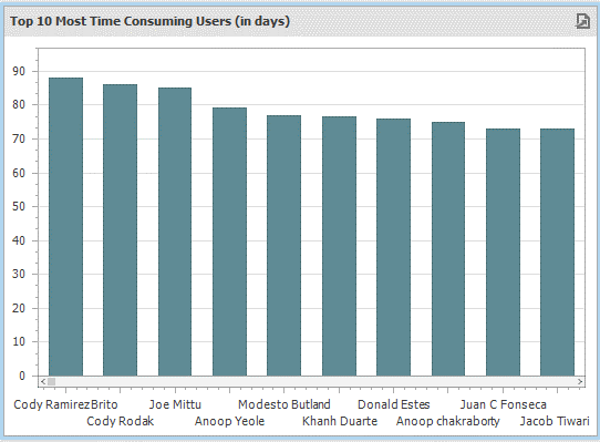
The chart presents information regarding “Top 10 Most Time-Consuming Users”. On X-Axis, users are plotted and on Y-Axis the time is plotted for each user. We can also clearly see from the chart that the alignment of the X-Axis labels is not clear.
The view might be better in this case if the users are plotted on Y-Axis and the Time is plotted on X-Axis.
Solution:
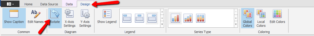
To change the view of the dashboard chart control, follow the steps below,
Step 1: Click on the chart.
Step 2: Click on the Design tab and click on the Rotate tab which will then rotate the view.
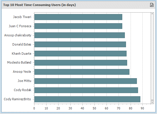
The updated chart below is simple, clear and presents the information without layout issues.
Comments are closed.