How Can We Help?
Question:
How do I plot values inside the chart control?
By default, the chart control plots the arguments on X-axis and plots the values on Y-axis as shown in the image below.
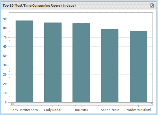
The chart presents the users on X-axis and time consumed on Y-axis. If I want to find out for each user the exact time consumed, this representation is a bit difficult and not clearly visible. In this case, it might be beneficial to display the value for each user inside the chart bar.
Answer:
To display the value inside the chart bar:
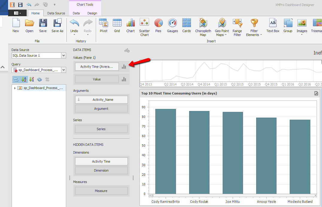
Step 1: Click on the existing designed chart in the dashboard designer.
Step 2: Click on the little Chart Icon next to the Values.
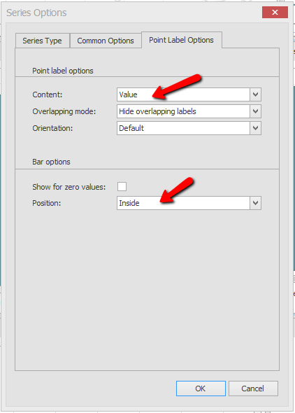
Step 3: In the opened ‘Series Options’ page navigate to Point Label Options, select ‘Value’ in Content Drop Down and Select ‘Inside’ in Position Drop Down and click OK.
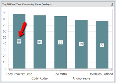
This will now present the value associated with each user inside the chart bars as shown below.
Comments are closed.